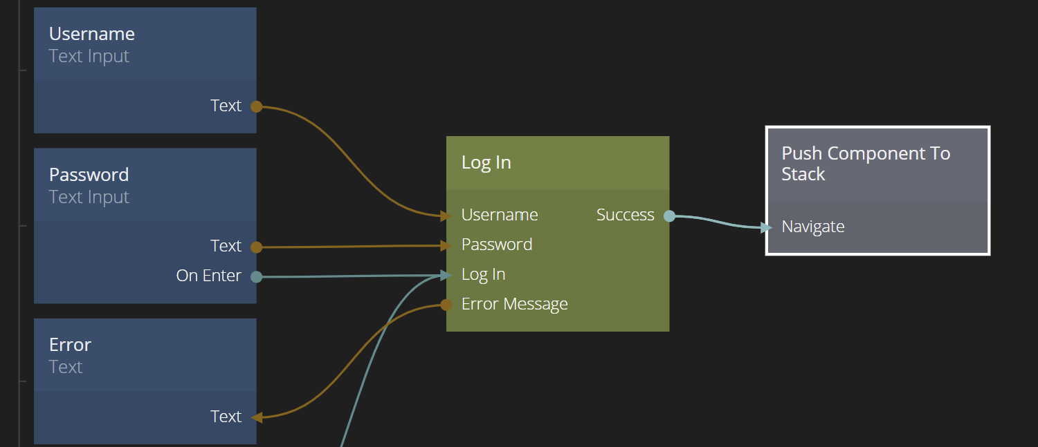
Push Component To Stack
The Push Component To Stack node is used together with a Component Stack to navigate to a new component (i.e. "push on the stack"). It is typically used when creating app style navigation. For more information on how Component Stack navigation work, check out the Component Stack documentation.

Inputs
| Data | Description |
|---|---|
| Stack | This property defines which Component Stack that the push will act on. The Component Stack is referred to by its name. |
| Mode | This property selects whether the previous components will be kept in the stack, beneath the new top component, (Push) or if all components will be replaced by the new top component (Replace), in which case the new component will be the only one on the stack. |
| Target Page | Here you select the target component to push on the Component Stack. The component need to be one of the component entries defined in the Component Stack to show up as an option here. |
| Signal | Description |
|---|---|
| Navigate | Sending a signal to this input will push the Target Page on the Component Stack. |
| Mixed | Description |
|---|---|
| Component Inputs | Any Component Inputs that the target component have will be available as inputs on the Push Component To Stack node. |
Transition
| Data | Description |
|---|---|
| Transition | The type of transition. Can be any of:None: No transition, the target component is immediately made visible.Push: The current top of the stack is "pushed away" while the new top enters.Popup: The current top is not changed. The new top enters with a transition on top of it.Not all of the parameters below are available for all types of transitions. |
| Direction | This is the direction the new top component enters from, and also the direction the current top is pushed away in, if the transition is Push. It can be any of Left, Right, Up, Down and In,Out. The latter zooms in vs out. |
| Shift Distance | This is the distance of the transition in either % or in px, i.e. the distance the component is moved in the specified direction. |
| Zoom | This is available if the Direction is set to In or Out and specifies the amount of zoom the transition should apply. |
| Crossfade | If enabled the target will fade in and the current top fade out. Only available for Push transitions. |
| Dark Overlay | Adds a overlay to the current top with the color #000000. Only available for Push transitions. |
| Dark Overlay Amount | The maximum opacity of the overlay. It starts at 0 and animates to this value. 0 disables it, and 1 makes the overlay animate to 100% opacity. Only available for Push transitions. |
| Fade In | Available for Popup transitions. This indicates if the new top component should fade in ou not during the transition. |
| Timing | This is a timing curve that controls the delay, duration and animation ease of the transition. |

The type of transition. Can be any of:
- None No transition, the target component is immediately made visible.
- Push The current top of the stack is "pushed away" while the new top enters.
- Popup The current top is not changed. The new top enters with a transition on top of it.
Not all of the parameters below are available for all types of transitions.
Outputs
| Signal | Description |
|---|---|
| Navigated | This signal is triggered when the Target Component has been pushed on the Component Stack. |
| Mixed | Description |
|---|---|
| Back Actions, Results | If the Target Component contains a Pop Component Stack with Back Actions and Results they will appear as outputs on the related Push Component. |